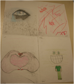
My Preliminary designs
Monochromatic Tempera Painting. Theme: emotion
I like Tempera paint because its easy to manipulate and thin down with water and get different effects
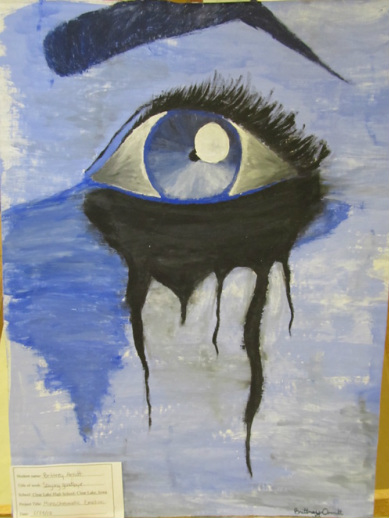
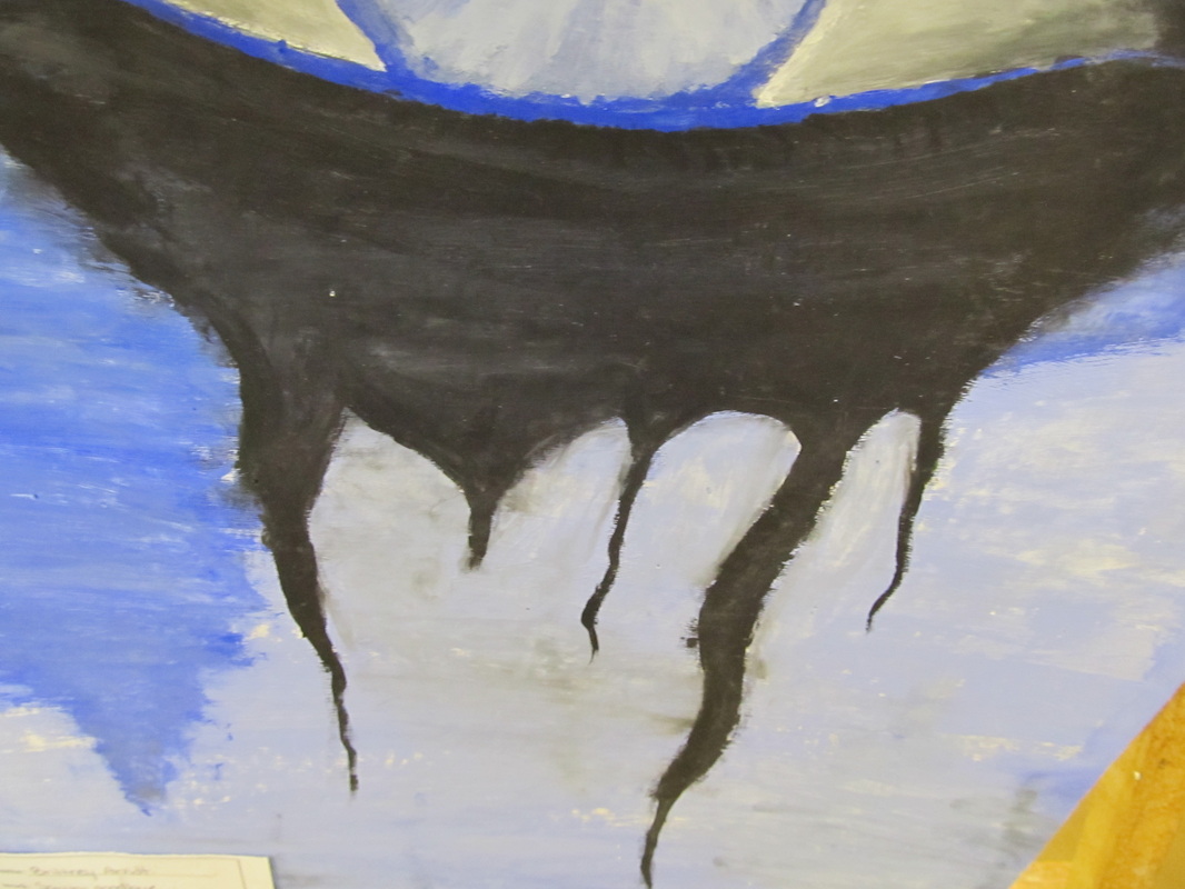
This is my first tempera painting. The emotion I captured is sadness
Exceeds Tempera Painting
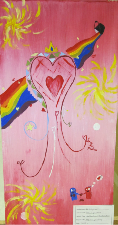
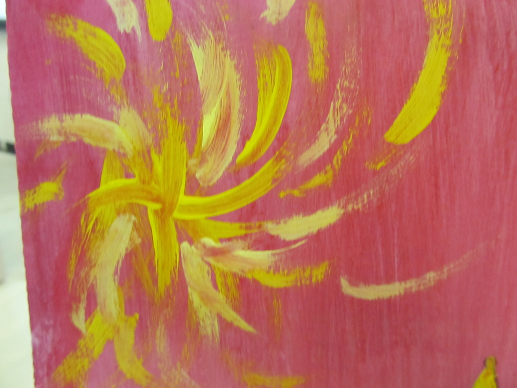
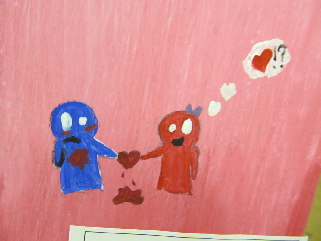
my overall Exceeds painting. I'ts kind of just a doodle I did for fun

Reflection
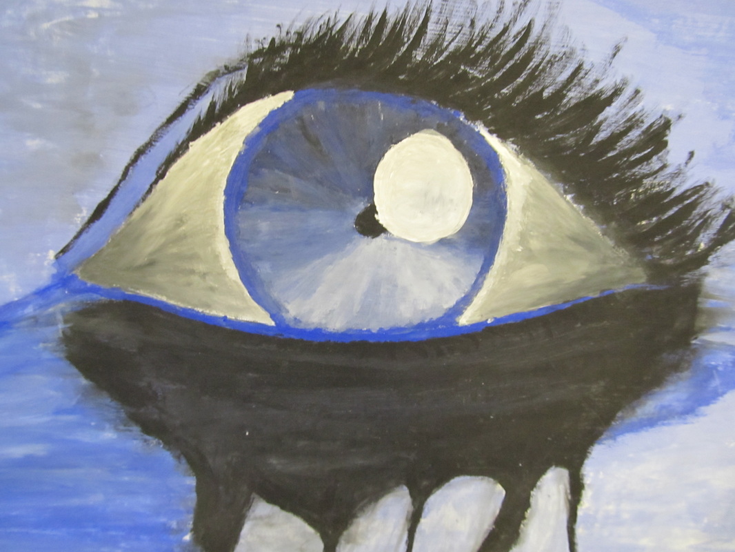
1. I believe the good/strong parts of my painting are the focal point of my painting which is the eye. I really like how it shows the sadness and pain that I was going for.
2. I think I could have found a way to fill out the dead space at the bottom instead of cutting off a few inches.
3. My emotion I was trying to reach was sadness mixed with pain. I used the hue blue, to achieve this. I chose sadness because I really like the color blue and I thought an eye would be a great way to depict that.
4. The main hue in my painting is blue, because blue is my favorite color and although im a generally happy person, I really like to draw/paint sad things.
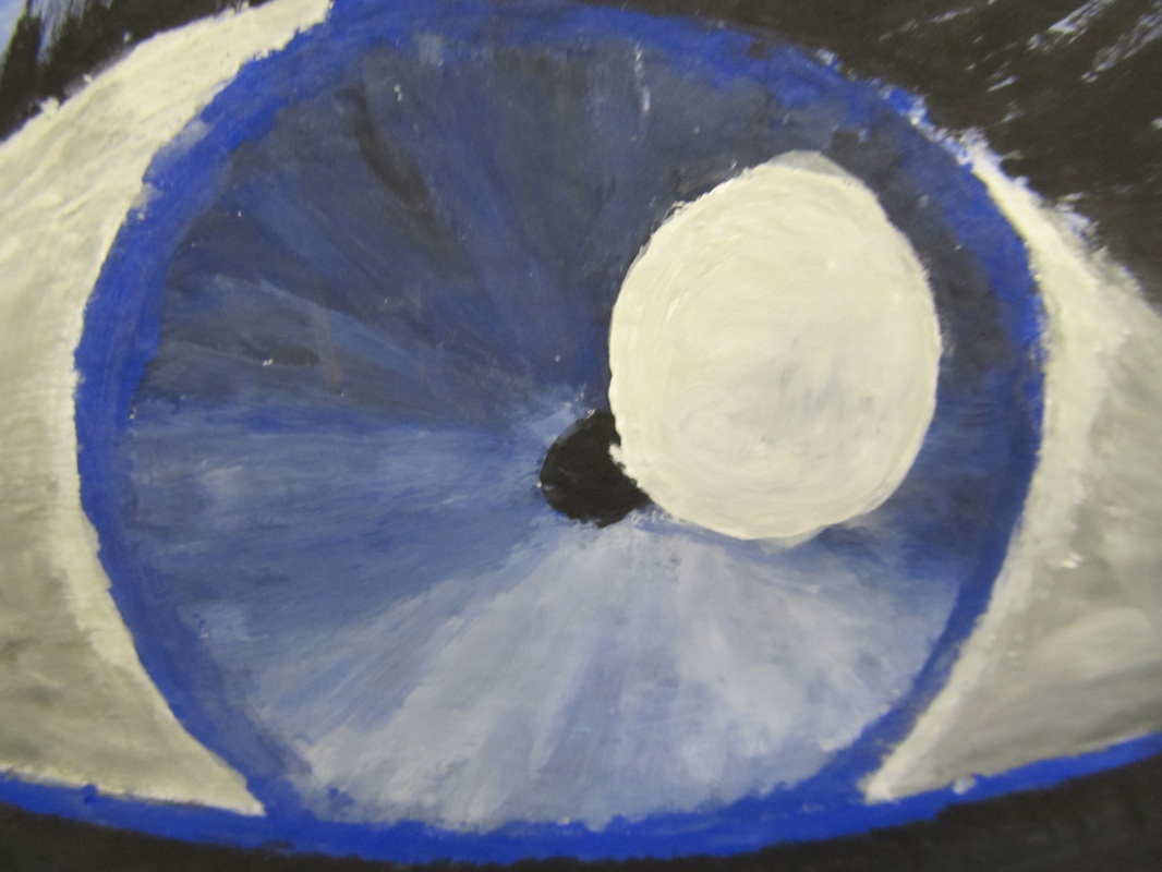
5.The background is where most of my light values are but theres also some in the iris of the eye. My dark values would definitley be the eye itself and the makeup running down from the eye.
6. I learned how water can be very helpful when trying to blend certain colors and I believe I can definitley use that technique on future paintings.
2. I think I could have found a way to fill out the dead space at the bottom instead of cutting off a few inches.
3. My emotion I was trying to reach was sadness mixed with pain. I used the hue blue, to achieve this. I chose sadness because I really like the color blue and I thought an eye would be a great way to depict that.
4. The main hue in my painting is blue, because blue is my favorite color and although im a generally happy person, I really like to draw/paint sad things.
5.The background is where most of my light values are but theres also some in the iris of the eye. My dark values would definitley be the eye itself and the makeup running down from the eye.
6. I learned how water can be very helpful when trying to blend certain colors and I believe I can definitley use that technique on future paintings.
